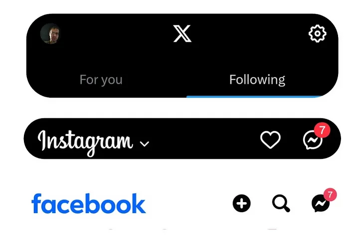
Creating a Responsive Navbar with Scroll-Based Visibility (Inspired by Instagram, X, etc.) using Vue.js
Don’t settle on an absolute-positioned <nav> element just yet. Creating a responsive navbar is easier than you think. In short, all you have to do is:
- Create the navbar element.
- Use a responsive variable (ref) to control the navbar’s vertical movement (translation) based on the user’s scroll.
- Implement a function that adjusts the navbar’s vertical position according to the user’s scroll behavior, triggered by each scroll event.
Here’s the code example for the responsive navbar:
<template>
  <nav ref="navbarRef" class="w-full bg-slate-950
    z-20 top-0 left-0 fixed
    border-b border-slate-700
    p-4" :style="{ transform: `translateY(${navbarTransform})` }">

<!-- Paste here any navbar code -->

  </nav>
</template>

<script setup lang="ts">

const navbarTransform = ref('0')
const navbarRef = ref<HTMLElement>()

let lastScroll = 0;

// Start calculating scroll diff in order to know how much to translate y
// from when user starts to scroll
let scrollStartUp = 0;
let scrollStartDown = 0;

const handleScroll = () => {
    const navbarH = navbarRef.value?.clientHeight as number
    const currentScroll = window.scrollY;

    if (currentScroll > lastScroll) {
        // scrolling down
        if (scrollStartDown === 0) { // Change only once on initial scroll up
            scrollStartDown = currentScroll
        }
        scrollStartUp = 0

        // - scroll diff

        navbarTransform.value = `${scrollStartDown - currentScroll}px`

    } else if (currentScroll < lastScroll) {
        // scrolling up
        if (scrollStartUp === 0) {
            scrollStartUp = currentScroll
        }
        scrollStartDown = 0

        const scrollDiff = -navbarH + scrollStartUp - currentScroll

        // - h + scroll diff
        navbarTransform.value = `${scrollDiff < 0 && scrollStartUp > navbarH ? scrollDiff : 0}px`
    }


    lastScroll = currentScroll <= 0 ? 0 : currentScroll; // For Mobile or negative scrolling
};

onMounted(() => {
    window.addEventListener('scroll', handleScroll);
});

onUnmounted(() => {
    window.removeEventListener('scroll', handleScroll);
});

</script>
Suppose you have the navbar already set, here is an example of mine (I am using vuejs and tailwindcss). The nav element’s class doesn’t matter here as long as it’s positioned fixed and on top of other elements (I use z-20 here):
<template>
  <nav ref="navbarRef" class="w-full bg-slate-950
    z-20 top-0 left-0 fixed
    border-b border-slate-700
    p-4">

<!-- Paste here any navbar code -->

  </nav>
</template>
Let’s start from declaring two refs:
navbarTransform — Will control nav vertical transformation.
navbarRef — Just to calculate navbar element height
const navbarTransform = ref('0')
const navbarRef = ref<HTMLElement>()
We’ll declare variables that should be outside of our functions:
let lastScroll = 0;

// Start calculating scroll diff in order to know how much to translate y
// from when user starts to scroll
let scrollStartUp = 0;
let scrollStartDown = 0;
Now let’s set up a function that’ll run each time our user scrolls the screen. The function will be added as an event-listener. Code:
const handleScroll = () => {
    console.log('scrolling');
};

onMounted(() => {
    window.addEventListener('scroll', handleScroll);
});

onUnmounted(() => {
    window.removeEventListener('scroll', handleScroll);
});
For each scroll event, handleScroll will modify navbarTransform that’ll control nav’s vertical transformation accordingly to scroll behavior. Here is the full function. Explanation afterwards:
const handleScroll = () => {
    const navbarH = navbarRef.value?.clientHeight as number
    const currentScroll = window.scrollY;

    if (currentScroll > lastScroll) {
        // scrolling down
        if (scrollStartDown === 0) { // Change only once on initial scroll up
            scrollStartDown = currentScroll
        }
        scrollStartUp = 0

        // - scroll diff

        navbarTransform.value = `${scrollStartDown - currentScroll}px`

    } else if (currentScroll < lastScroll) {
        // scrolling up
        if (scrollStartUp === 0) {
            scrollStartUp = currentScroll
        }
        scrollStartDown = 0

        const scrollDiff = -navbarH + scrollStartUp - currentScroll

        // - h + scroll diff
        navbarTransform.value = `${scrollDiff < 0 && scrollStartUp > navbarH ? scrollDiff : 0}px`
    }


    lastScroll = currentScroll <= 0 ? 0 : currentScroll; // For Mobile or negative scrolling
};
First, we save navbar height and user’s y scroll value. Then, we check whether user scrolled up or down by comparing currentScroll to lastScroll (which we set at the end of function:
lastScroll = currentScroll <= 0 ? 0 : currentScroll; // For Mobile or negative scrolling).
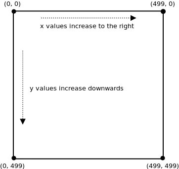
If currentScroll is bigger than lastScroll, it means user is scrolling down as positive y direction is downwards from top of the screen.
If user scrolls down:
if (currentScroll > lastScroll) {
        // scrolling down
        if (scrollStartDown === 0) { // Change only once on initial scroll up
            scrollStartDown = currentScroll
        }
        scrollStartUp = 0

        // - scroll diff

        navbarTransform.value = `${scrollStartDown - currentScroll}px`
}
- Save the starting point so we’ll know how much we scrolled relatively to that point (and adjust navbar accordingly)
- Set the starting point of down-scrolling to zero so we’ll update it once again on next down-scroll.
- translate nav’s y to a negative value (up) equal to how much we scrolled down since we started scrolling down (which means that if the navbar is 100px, we’ll need to scroll down 100px in order for it to dissapear)
If user scrolls up:
else if (currentScroll < lastScroll) {
        // scrolling up
        if (scrollStartUp === 0) {
            scrollStartUp = currentScroll
        }
        scrollStartDown = 0

        const scrollDiff = -navbarH + scrollStartUp - currentScroll

        // - h + scroll diff
        navbarTransform.value = `${scrollDiff < 0 && scrollStartUp > navbarH ? scrollDiff : 0}px`
    }
- Save the starting point as before.
- Reset the down-scrolling starting point as before.
- Calculate how much we’ll need to translate Y of navbar. keep in mind our starting point is
— (minus) navbar height. To that point we’ll just add how much we scrolled (diff. between starting point and current scroll). - Finally we’ll update the translateY value only if diff. smaller than 0 (otherwise navbar will translate too low) & scroll starting point is bigger than the navbar itself (otherwise at the top of the screen it’ll disappear on up-scrolling because nav would start sliding down from top to bottom again even though there’s nowhere to scroll upwards and so it won’t slide down).
Last thing left to do is connect navbarTransform ref to the nav element it self using :style="{...}":
<nav ref="navbarRef" class="w-full bg-slate-950
    z-20 top-0 left-0 fixed
    border-b border-slate-700
    p-4" :style="{ transform: `translateY(${navbarTransform})` }">
Final code:
<template>
  <nav ref="navbarRef" class="w-full bg-slate-950
    z-20 top-0 left-0 fixed
    border-b border-slate-700
    p-4" :style="{ transform: `translateY(${navbarTransform})` }">

<!-- Paste here any navbar code -->

  </nav>
</template>

<script setup lang="ts">

const navbarTransform = ref('0')
const navbarRef = ref<HTMLElement>()

let lastScroll = 0;

// Start calculating scroll diff in order to know how much to translate y
// from when user starts to scroll
let scrollStartUp = 0;
let scrollStartDown = 0;

const handleScroll = () => {
    const navbarH = navbarRef.value?.clientHeight as number
    const currentScroll = window.scrollY;

    if (currentScroll > lastScroll) {
        // scrolling down
        if (scrollStartDown === 0) { // Change only once on initial scroll up
            scrollStartDown = currentScroll
        }
        scrollStartUp = 0

        // - scroll diff

        navbarTransform.value = `${scrollStartDown - currentScroll}px`

    } else if (currentScroll < lastScroll) {
        // scrolling up
        if (scrollStartUp === 0) {
            scrollStartUp = currentScroll
        }
        scrollStartDown = 0

        const scrollDiff = -navbarH + scrollStartUp - currentScroll

        // - h + scroll diff
        navbarTransform.value = `${scrollDiff < 0 && scrollStartUp > navbarH ? scrollDiff : 0}px`
    }


    lastScroll = currentScroll <= 0 ? 0 : currentScroll; // For Mobile or negative scrolling
};

onMounted(() => {
    window.addEventListener('scroll', handleScroll);
});

onUnmounted(() => {
    window.removeEventListener('scroll', handleScroll);
});

</script>
Thanks for reading :)